
The Kids Activity Planning app

MY ROLE: UX/UI designer and UX researcher TOOLS: Figma, Adobe Photoshop, Adobe Illustrator TIMELINE: 10 weeks
Project Preview
As a fellow mom and someone deeply connected to the parents' community, I understand the challenges of discovering activities suitable for all age ranges and different needs of kids. That's why the Gokiddo app is here to help. Our mission is to simplify busy parents' lives by providing a user-friendly platform that empowers them to efficiently manage their time and create meaningful experiences with their kids.

Design Process
I follow a structured design process to ensure the creation of an effective and user-centered application. The design process consists of five key stages: Discover, Define, Ideate, Design, and Test.

Competitive Analysis
To gain market insights, I conducted a competitive analysis of mobile app competitors. I identified key players and examined their products, features, target audience, and business models.

Additionally, I performed a SWOT analysis, evaluating Strengths, Weaknesses, Opportunities, and Threats, to better understand the competitive landscape.
User Research
Methodology:
I chose to conduct a contextual inquiry as my research method because I believed it would provide a deeper understanding of parents' activity planning process. By visiting parents in their natural environment, actively observing, and interviewing them, I gained valuable insights. During the inquiry, I asked a series of questions to understand their demographic background, how they planned activities, the tools they used, and the features they found helpful in an app.
Participants:
Engaging with four carefully chosen participants, I captured their experiences, challenges, and suggestions, which informed the design of an activity-planning app tailored to their needs.
Engaging with four carefully chosen participants, I captured their experiences, challenges, and suggestions, which informed the design of an activity-planning app tailored to their needs.
Data analysis:
Engaging with four carefully chosen participants, I captured their experiences, challenges, and suggestions, which informed the design of an activity-planning app tailored to their needs.
Engaging with four carefully chosen participants, I captured their experiences, challenges, and suggestions, which informed the design of an activity-planning app tailored to their needs.
Engaging with four carefully chosen participants, I captured their experiences, challenges, and suggestions, which informed the design of an activity-planning app tailored to their needs.
Engaging with four carefully chosen participants, I captured their experiences, challenges, and suggestions, which informed the design of an activity-planning app tailored to their needs.
Engaging with four carefully chosen participants, I captured their experiences, challenges, and suggestions, which informed the design of an activity-planning app tailored to their needs.
Affinity Mapping
As I conducted the affinity mapping process, I gathered qualitative data from user interviews and observations. I wrote down each idea or insight on separate sticky notes and organized them based on similarities and themes. By visually mapping out the connections between ideas, I gained a clearer understanding of the patterns and trends within the data. This process helped me identify important insights and informed the design decisions for the user experience.
.png)
User Personas
By incorporating user personas into the design process, I gain valuable insights that guide my decisions and enable me to prioritize features according to the needs and expectations of my target users.


Empathy Mapping
As I used empathy maps, I gained a deeper understanding and empathy toward users. They provided insights into their needs, desires, and motivations, helping me create more user-centered and empathetic solutions as a designer. I created two empathy maps—one focused on users with accessibility needs and the other centered around diversity and inclusivity.


Journey Map
When creating a journey map, I gain a comprehensive understanding of the user's experience and emotions throughout their interaction with the product.

Information Architecture
I obtained valuable insights by conducting the card sorting test and considering parents' perspectives and preferences. The analysis of the test led to the identification of key findings and recommendations for each category.

Cart sorting Test Result:

Site Map
I utilized a site map to create a clear and visually structured representation of the navigation layout, overall organization, and hierarchy of the site's pages. The site map helped in designing an effective navigation system for the website.

User Flow
By prioritizing a seamless user flow, I aim to enhance the overall experience of parents using the app.

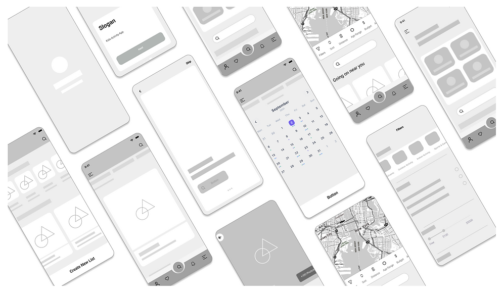
Wire Framing

I sketch wireframes by following a structured process. I start with low-fidelity sketches to explore layout and content placement.
I iterate and refine the sketches. Then, I convert them to digital wireframes using Figma. My focus is on simplicity, clarity, and user-centric design principles.

Usability Test
I tested my prototype on five parents (3 females, and 2 males) to validate my proposed design solutions. Through testing, I discovered some hesitation and incorrect clicking; the reason was that I did not prototype all the components for this scope of my project.
.png)
Methodology
-
One-on-one moderated and scenario-based testing
-
Participants were given specific tasks related to navigation, filtering activities, and searching for activities.
-
Observing participants' actions, comments, and feedback
-
Encouraging participants to think aloud for additional insights
Test Task
-
Had participants to perform a search for a specific activity, explore the activity categories, and apply various filters (age range, duration, location)
Goals
-
Determine overall ease of use, including navigation and label clarity
-
Evaluate the ability to discover activities through categories or the search engine
-
Assess the effectiveness of using filters to customize and personalize the search
Result
-
(60%) of the participants completed the tasks successfully
-
(80%) of the participants found the navigation straightforward and intuitive.
-
(80%) found the top-level navigation menu, filters, and activity categories clear and easily identifiable.
-
(20%) of the participants found it hard to locate the like button
-
(20%) of the participants confused with scrolling to the left for more recommendations:
Iterations
Prototype


Clickable
Prototype
Click Around The App Here >
