.png)
USABILITY TESTING:
Huntsville County Library Project
📌Project Scope
Timeframe: Fall 2023
My Role: UX Researcher
Team: Shiva Vakili, Kay Champagne, Drew Yarbrough, Lizzy Young
Methods: Heuristic Analysis, Usability Testing
Tools: Google Docs, Microsoft Word, Zoom, Canva, Excell
Project Preview
🎯 OBJECTIVES
👥 PARTICIPANTS
👀 RESULTS
🌟RECOMMENDATIONS
The Huntsville-Madison County Public Library is the oldest public library branch in the state of Alabama, and it serves the residents of Madison County. The library offers online services, computer training, an extensive digital collection, public-use computers, free Wi-Fi service, meeting spaces, and much more. The primary purpose of the website is to provide information about the library’s collections, services, and events.
The goal of this study is to collect data and evaluate issues associated with the usability and accessibility of the Huntsville-Madison County Public Library website. Usability is the assessment of how easy it is for a user to navigate and use a site, while accessibility is how easy users with disabilities can use the same site.
The researchers, a group of four students from The University of Alabama in Huntsville's Usability Studies course, used a heuristic analysis to assess accessibility concerns, with a particular focus on those that affect users who have visual impairments. Additionally, the researchers tested the site's usability with 11 (n=11) users in all.
The results of the accessibility heuristic included that:
-
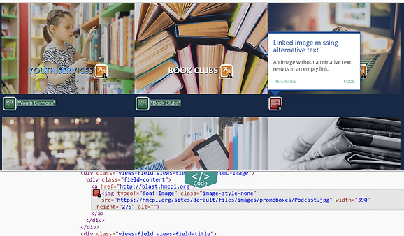
Alt text was missing across the entire site
-
Numerous unordered lists across the site presented challenges to accessibility
-
Numerous adjacent links go to the same URL
Results of the usability testing included:
-
Participant demographics
-
Pre and post-test results
-
Challenges with the site’s search bar
-
User expectations for library website use
-
User feelings towards the site’s look and feel
-
Digital download confusion
-
Lack of content organization
Recommendations for improving accessibility include:
-
Add alternative text to images conveying information
-
Utilize numbered lists, rather than bulleted lists
-
Reduce redundancy by consolidating links into a single link with descriptive text
Recommendations for improving usability include:
-
Add additional drop-down menus for easy navigation
-
Continue to utilize menu items on the homepage
-
Add a clear explanation of was the Hoopla service is
-
Set the search bar default to search the entire site
-
Refresh old content and links to provide consistency across the site
-
Add home button to the header
METHODS
The study employed heuristic analysis and usability testing to evaluate the Huntsville-Madison Public Library website.
Heuristic Analysis: Used to assess website performance on accessibility standards, including unordered lists, redundant links, and alt text presence.
Usability Testing: Provided insights into user pain points, behaviors, preferences, and satisfaction regarding common tasks, finding event and general library information, website accessibility, and overall enjoyment.
🧠 HEURISTIC ANALYSTIC
-
Utilized accessibility standards from WebAIM for the heuristic analysis process.
-
Employed the WAVE accessibility checker tool to identify and explore accessibility errors.
-
Identified Issues: Included unordered lists, redundant links, alt text errors, and others as identified by the WAVE tool.
🕹️ USABILITY TESTING
-
Usability Test Duration: The test lasted an average of 25 minutes, conducted through a mix of in-person and Zoom interviews.
-
Pre-Test Questions: Users answered demographic and website familiarity questions before the test.
-
Demographics: Initial impressions, aesthetics perception, expectations, and navigational feedback were gathered during the first look.
-
Usability Tasks: Participants completed 9 tasks focusing on identifying usability and accessibility pain points.
-
post- Test: After the test, participants answered exit questions to summarize their experience, highlight positive and negative aspects, and provide recommendations.
-
Transcription and Analysis: Tests were transcribed using Trint software, followed by thematic analysis by the research team to interpret trends in the data.
Accessibility Results
The research team identified accessibility errors using the WAVE tool.
The data revealed 3 main themes relating to accessibility:
1. Alternative Text
-
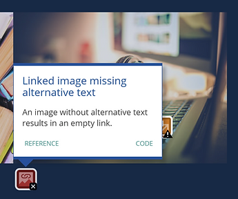
Alt Text Issues: Alt text was absent throughout the website, particularly notable in informational graphics.
-
Impact on Accessibility: Critical visual information provided by photos and graphics lacked alt text, creating significant barriers for screen reader users.

2. Unordered Lists
-
Properly ordering lists ensures content is presented to users in the intended sequence, enhancing accessibility.
-
Unordered lists pose challenges for screen readers in properly ordering web content, necessitating corrective action for improved accessibility.
-
The Events page had the highest density of unordered list errors, totaling 17 errors.

3. Redundant Links
-
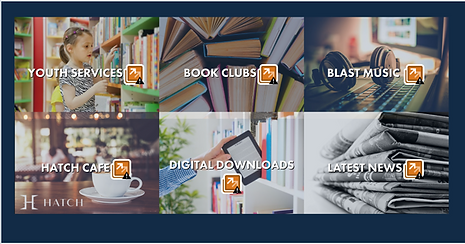
These errors involve adjacent links directing users to the same URL, leading to unnecessary navigation and repetition, particularly impacting users relying on assistive technologies like screen readers or keyboard navigation.
-
On the Home page, there are many duplicate links found within a grid of images, aimed at swiftly guiding users to important sections or content on the website.

Usability Results
👤Demographics
-
During usability testing, participants emphasized the importance of easy navigation, access to research journals, online book checkout, and options to refine searches for materials like magazines and teasers.
📝 Pre-Test
-
The research team conducted pretest questions to gather demographic information, understand the comfort level of navigating websites in general, and collect information regarding library familiarity.

📈 Post-Test
when users were asked about their positive and negative experiences.
“It was more challenging than I would have liked. If I couldn't find information about the makerspace here, I would resort to Google searches and navigate through the links. It seems unnecessarily difficult for certain things that should be straightforward.”."
“I found that there were some challenging areas. So I think that this website could use some improvements.”
"I found it quite good; I managed to locate everything I wanted."
“The little tabs at the top that made it easy to find information.”
“I found that there were some challenging areas. So I think that this website could use some improvements.”
When participants shared their thoughts on their overall website experience:
“Visually appealing, and easy to navigate. The best part was, a lot of basic stuff on the homepage to access.”
“The worst part was the search bar leading to the catalog instead of the website itself.”
“I'd say that the worst part about the experience was finding out that there was a Lego Club, but not being able to see them the next time they met up was.”
Users were asked what improvements or changes they would recommend to make the website better to navigate.
“Under events, if they had a master calendar. That would be helpful.”
“Perhaps they could consider adding highlights at the bottom of the page, just under the home page. This way, if you have the shortcut, it would be more convenient.”
“I would suggest perhaps rearranging some of the buttons such as the locations button onto this tab, which is where I would expect it to be at the very top of the page is usually for personal information or contact information, things like that.”
Participants were asked to rank on a scale from 1-10, with 1 being very easy, and 10 being very difficult to use.

📋TASKS RESULTS
-
Adding a book to digital downloads caused confusion, as users were unsure about exiting the library site and lacked information about available third-party options.
-
Many participants struggled with the search bar, which defaulted to searching the book catalog instead of the website, and they were unaware of the option to change search criteria.
-
The lack of intuitive content organization led to moderate challenges in navigation, with participants clicking on multiple buttons and pages before finding desired information.
-
Participants expressed difficulty in finding specific information, such as book club details, and encountered confusion when browsing and searching for content.
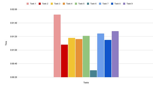
Average time per test task

Recommendations- Accessibility
Three primary themes concerning accessibility emerged from the heuristic analysis of the Huntsville-Madison County Library website.
1-Alternative Text Recommendations
Alternative text was largely missing across the site. Significant resources should be devoted to distinguishing between informative and decorative images across the site and then developing alternative text for the images and graphics that convey critical information.

2-Unordered Lists Recommendations

To improve list organization for screen reader users, numbers should be used instead of bullets.
Unordered list in the website footer
3-Redundant Links Recommendations
Consolidating the redundant links into a single link and eliminating any duplicate text or alternative text.

Recomendations - Usability
👍Positives
Users found the homepage visually appealing and easy to navigate.
Visual cues such as contrasting colors, larger fonts, and strategic placement were highlighted for drawing attention to important information.
Adding dropdown menus corresponding to different website areas is recommended to enhance navigation.
Users appreciated the navigation buttons at the top of the page. However, they found the search bar more appealing due to its functionality, which made the buttons less attractive.
We would recommend continuing the use of menus on the home page.
The home screen made it easy to access information.
A limitation of this was that the home screen being so accessible and good at it’s job made participants avoid other parts of the website that could’ve used some testing.
👎Limitations
and Pain Points
Add a clear explanation of was the Hoopla service is.
Users were confused when trying to rent a book digitally, especially when selecting "Hoopla" as the checkout option. The name "Hoopla" doesn't clearly indicate digital downloads, causing uncertainty among users. They expressed confusion and hesitancy, highlighting the need for a clearer explanation of Hoopla's purpose and how to use it for digital downloads.
The search bar default should be set to search the website, not just the book catalog.
The search default led to many unsuccessful search attempts. Participants never noticed the additional drop-down menu to change the search setting. We recommend setting the search bar default to search for content on the entire site, rather than limiting the search to only the book catalog.
Each page of the website should be consistent.
Links lead to older versions of sites which then offer alternative routes to information. Our recommendation is to have a reorganization of the site to ensure the information architecture is updated and inline with the intent of the website.
A return to home button should be made apparent.
Users didn’t know that the Huntsville-Madison library logo would lead them back to the home screen, which created confusion about how to return to the home screen. Our recommendation would be to add a home button at the top of the page so that users can easily go back to the home screen.